The Project
I was hired by TodayTix to work on their new Encore White Label offering. This was a theatre booking website geared towards retailers wanting a customisable white label solution. The project required a complete redesign of the upper funnel pages and the creation of a new seating chart and checkout journey.

The UX Process


FigJam UX Workshop
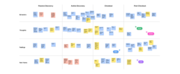
The Product Design team consisted of four designers and a Design Director. We worked individually within our own squads and together on discovery projects where we would collaborate in UX workshops to identify product requirements.
Personas For Theatre Goers
From an initial set of user interviews, we could identify a group of theatre goer personas. These personas applied differently to the various sub-brands under the TodayTix umbrella. Todaytix.com, London Theatre, New York Theatre Guide and the White Label all have slightly different propositions.
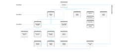
User Flows And Entry Points
The redesign of the website started off by mapping out an updated user journey of the booking experience. We had to take into account that different retailers would access the White Label website from different points of the journey. For example, some retailers only advertise theatre shows via an email and would not need a homepage.
Component Library
All the components used in the White Label redesign needed to be created using an Atomic Design System, where smaller components group together to create larger ones. This process made the Design System very consistent and logical. I was also able to use some of Figma's latest features like Properties and Component Sets.
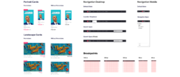
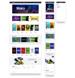
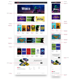
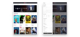
Homepage And Navigation
The new homepage design included a simplified navigation, visually appealing promotional banners and an offers section, but also the ability to sell both theatre tickets and tickets for attractions and events. It was important for us to design using a responsive grid framework so that our designs would work in all breakpoints.
White Label Customisation
Working with the development teams, we mapped out the customisation options for the White Label experience. The various 'Classes' that we identified for customisation could be changed by retailers through a front-end tool called 'The Styler'. This created an almost self service environment for customisation of the website.
Category Pages And Filters
We created a new filtering system for the Categories page that would work on both desktop and mobile. This was going to be tracked using an analytics tool to see which of the filters were being used and which were not. An accordion design also allowed for expanding and collapsing of the filters.
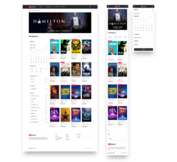
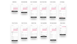
Categories Tablet Breakpoint
I realised that there was a breakpoint in which the desktop design didn't fit into and the mobile designs didn't expand into. This meant that a third design needed to be created for a tablet breakpoint. Here you can see the filters panel animates out from the side allowing for a smaller screen and still using the same filters component.
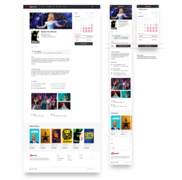
Product Details Page
The Product Details page was designed to be more content first with a focus on the details behind the show and the event. The booking calendar used a promotions colour that was customisable. This allowed different retail brands to specify a promotions colour to match their offline promotions within the White Label experience.
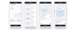
Calendar Variations
The validation process for booking a theatre ticket was slightly different to booking an attractions ticket. Therefore, I documented the variations and nuances of the attractions flow within the Figma design file and shared it with the development team.

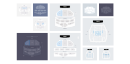
Research Seating Charts
Tasked with having to create a new bespoke seating chart for the TodayTix group was a big responsibility. The project started off by researching the many theatre booking sites online and evaluating how they solved the problems encountered in seat selection. Below you can see the same Ambassadors Theatre from a variety of theatre booking sites.
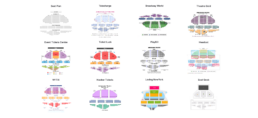
Seating Chart Concepts
The initial seating chart concepts ranged from basic and rigid maps to seating charts that followed the contours of the theatre. I also experimented with overlapping the Orchestra section with the Mezzanine to create an effect more closer to the way a real auditorium would look. A dark mode concept was appreciated by most of the team but was difficult to implement.
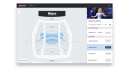
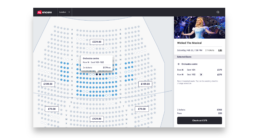
Final Seating Chart Designs
The final designs for the seating charts separated the price discovery from the seat selection. A user would be able to hover on the seating map to select a price bracket or scroll through the list on the right hand side. We also included a 'Best Values' area where a retailer could highlight promotions or notable deals.
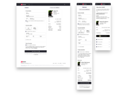
Single Page Checkout
The previous Checkout flow was a three page process that included an unnecessary Basket page. Through researching some best practices of Checkout flows using second hand research via Baymard Institute, We created the new Single Page Check page which streamlined the process and reduces unnecessary friction.